In
the following steps you will learn how to create a detailed cheese text
effect and a cheese wedge illustration. For starters you will need a
simple piece of text, the 3D Extrude & Bevel effect, and a simple
Rounded Corners effect. You'll learn how to easily name and organize
your shapes, how to create compound paths, how to cleverly use blending,
masking and vector shape building techniques, and how to take full
advantage of the Appearance panel. Lastly, you will learn how create a
simple blend and how to use the Live Corners feature
In this tutorial I will give you an example of how to create a movie
teaser poster. It will show you how to draw a mask for your character
using the pen tool , blend modes and textures.
Also, I will be talking about usage of color for your environment,
how to make your images sharper and I will give some tips on how to add
more detail to your work.
You are minutes away from your new logo. You can download AAA Logo right now! No registration or personal
information is required, Create
logos for your website or print. It is so easy to do with AAA Logo
- powerful logo maker / logo creation software. The download and
installation will take only a few minutes.
This tutorial we will show you how to create a flaming car. We saw this
effect before and it’s quite simple but it’s a good exercise and the
result is quite good. You can also apply this effect on other images.
The first video, below, starts by covering the basics of the new Pencil
Tool, and exploring the simplified Options Panel. If you want to follow
along, you'll need the tutorial files which you can download here.
The second video, below, explains how to create more complex shapes. You'll learn how to continue a path, complete a shape, and create straight and curved segments. It also shows you how you can use the Path Segment Reshape feature to make some finishing touches to the illustration.
To make working in Illustrator CC quicker and easier, Adobe has also released this PDF cheat sheet of keyboard shortcuts.
In this episode special guest Mordy Golding is here to show is 5 tips to
make drawing easier in Adobe Illustrator. These are great tips for
beginners as well as experienced users that are new to Adobe Illustrator.
Today at Graphic Education and Tutorials, Filipino graphic artist, Niño Batitis,
prepared an advanced Photoshop tutorial. We’ll show you how to create
and put a simple energy sphere effect into your photographs.
Follow the step-by-step instructions below and try to recreate this ENERGIZING tutorial!
Before we start, save this image that we’ll be using for the tutorial on your computer.
Step 1 – Crop (C) the lower part source image as seen on the image
below, and adjust its Hue/Saturation (Ctrl+U – Hue: 1, Saturation: -52,
Lightness: 0) & Curves (Ctrl+M – Output: 0, Input: 18) settings.
Step 2 – Create a new layer (Ctrl+Shift+N) and draw a swoosh-like path between the image’s hands using the Pen tool (P).
Step 3 – While the Pen tool is still active, do the following steps:
Right click > Stroke Path > Tool: Brush > Check Simulate
Pressure box > Click OK > Press Enter. Prior to those steps, you
need to set up your brush tool (B) to achieve the blurry effect. Press
F5 to open the brush setting window. Select a feathered (#25) brush tip
shape and check the Shape Dynamics and Smoothing boxes. Use #9ef8fb for
the brush fill and match the brush size as seen on the image below.
Step 4 – Select the swoosh path’s layer and then go to Filter >
Blur > Gaussian Blur > OK. Duplicate the layer (Ctrl+J) and set
its Opacity to 20%. To add more light effect, create a new layer and
apply a feathered brush in #9ef8fb fill color to the areas indicated on
the image below.
Step 5 – Now what we would like to do is put some of the light behind
the hand. Use the pen tool to path and duplicate a part of the hand.
Put the layer on top of the light and use the Eraser tool (E) to remove
some areas of the hand to make it look like some light is passing
through.
Step 6 – The next thing we’ll have to do is the lens flare effect.
Create a new layer on top of all layers and fill it with black using the
paint bucket tool (G). Go to Filter > Render > Lens Flare >
OK. Set the layer’s blending mode to Color Dodge and Opacity to 95%.
Erase some areas of the lens flare by using a layer mask.
Step 7 – Create more swoosh paths in different layers just like we
did on steps 2 and 3. This time we want to do a little variation so
we’re gonna add the following layer styles: Gradient Overlay
Blending Mode: Normal
Opacity: 100%
Style: Linear (Align with Layer)
Angle: 90
Scale 100% Outer Glow
Blend Mode: Screen
Opacity: 100%
Noise: 0%
Technique: Softer
Spread: 0%
Size: 9px
Range: 59%
Jitter: 93%
Step 8 – Download these free smoke brushes.
Use one of the brushes in the set to create a smoke-like effect on the
hands. Using the erase tool, remove some parts of the smoke as seen on
the image below.
Step 9 – Create a new layer and using the brush tool, apply a #9de9e1
brush at 20% Opacity to the skin of the male image. Change the layer’s
blending more to Color — you will see a slight change in the skin tone
as it imitates the reflection of light.
Step 10 – For the final touches, create another new layer and fill it
with black. Change the layer’s blending mode to Color Dodge. Using the
brush tool, apply a white brush on the areas encircled on the image
below to exaggerate the light effect.
Final output:
Try applying what you’ve learned in this tutorial to your own
photographs. Feel free to share your works with our readers through the
comments box below!
In this tutorial, we're going to
create some really sharp-looking glow effects using a combination of
layer styles, the Pen Tool and Color Blending. The end effect is quite
stunning and hopefully you'll pick up some tips you didn't know before.
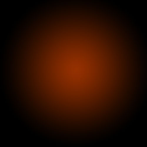
Step 1:
As with pretty much every tutorial I've ever written, we begin with a
radial gradient. This one is pretty harsh and goes from a reddish brown
color to black. Here are the exact color codes:
Foreground color - #922f00
Background color - #000000
Step 2:
In this tutorial, we actually need a pretty intense center, so what
we'll do is duplicate the layer we just made and set the one above to a
blending mode of Color Dodge. There are a few types of blending modes,
darkening ones, lightening ones, colorizing ones and inverting ones.
Color Dodge is probably the strongest of the lightening ones. As you can
see in the screenshot, it produces a pretty full-on center.
Step 3:
Now in our glow effect, it helps to have a nice textured background.
So we are going to create a sort of smoky haze. To do this, create a new
layer, then make sure you have white, #ffffff, and black, #000000,
selected as your background and foreground colors.
Then go to Filter > Render > Clouds. This will give you the same random cloud pattern as above.
Step 4:
Now set the opacity of your layer to Overlay and 30% transparency. In
some instances this would be enough, but for our needs we want it even
smokier looking!
So go to Filter > Sketch > Chrome and use default settings of 4
and 7 for detail and smoothness respectively. Actually you can probably
mess around with those if you want, but the defaults seem to be fine.
When you're done, the result should look a lot smokier (once its
overlayed at 30% transparency that is). You can see the result in the
background of the next screenshot.
Step 5:
Now before we can start making glows, we need to have something to glow.
Here's where we break out the pen tool. If you have used the pen tool
much I suggest playing around with it a little. There are some tricky
things you can do with shortcuts, but for this tutorial you don't need
those.
In fact all we want to achieve are some nice curves. Fortunately this
isn't too hard. I find the trick is not to use too many points. Instead
rely on the Pen Tool's natural curving and drag the mouse out for each
point so you get a big angle. In this S-curve shown above, I've only
used three points, the starting point, the end point and one in between
to give it the bend.
Step 6:
Once you have a nice curve, create a new layer. Then click on the
Paintbrush Tool (B) and choose a very thin, hard brush. As you know,
soft brushes are the blurry ones and hard brushes are more solid. In
this case I suggest using a thickness of 3.
Note that you can have any color selected as your brush color because we'll go over it with a layer style shortly.
Step 7:
Now switch back to the Pen Tool. You must switch tools in order to do this next bit.
Then right-click and select Stroke Path. A little dialog box will
appear as in the screenshot. Choose Brush and make sure there is a tick
next to Simulate Pressure. This is important as it will give your curve
tapered ends which will make it rock!
Next right click again and select Delete Path.
Step 8:
You should now have something like the above. Just a thin, cool swishy thing.
Step 9:
Now we add some glows. The easiest way to make our glows is to use
layer styles. And the best way to tell you what layer styles to use is
to tell you to download the sample Photoshop PSD from the bottom of this
page and then open it up and look through them there.
In a nutshell, I've added two sets of glows. To do this I first use
Outer Glow and then because I want a second glow, I change the Drop
Shadow settings so that it becomes a glow (you can do this by reducing
the Distance and changing the blend mode to something like Color Dodge)
Oh and also I've used a Color Overlay to make the item white so that its like the center of an intense glow.
Step 10:
So now you have the same line but with a cool glow coming off it.
The beauty of using a layer style is that you can copy and paste it to
other layers. To do this you just right-click the layer and select Copy
Layer Style then create a new layer and right-click and choose Paste
Layer Style.
Step 11:
So now repeat the same process a couple of times to make more squiggly lines.
In this instance, I made one a little thicker by changing the paint
brush size before I did the Stroke Path bit of the process. I also made a
third line and erased part of it and sorta made it join the other two
to look like a cool triangular shape.
Step 12:
Here I've added some text in and applied the same layer style to the text layers.
It's important to pay lots of care and attention to your text. When
you're first starting out, use simple fonts and play with spacing
between letters, words and sizes. You can achieve a lot with just some
small tricks. Here I've contrasted the three words by making Glow a lot larger and in regular casing, then made Advanced and FX much smaller, with greater space between the letters and all caps.
You can control spacing with text using the Character window. If it
isn't already open go to Window > Character and it should appear.
Mess about with the different settings until you learn what each
controls.
Step 13:
Now we add some particles. To do this, create a new layer then
select a tiny paint brush - size 3 - and just paint some dots on. It
helps if they are clustered towards the center of the glow so that it
looks like they are emanating from there.
You can make some of the central ones larger by doubling over on them with a second paint brush dab.
Then paste our Glow layer style on to that layer too!
Step 14:
Now that's looking pretty cool, but it will look even cooler if we
give it some subtle coloring instead of this super gaudy red.
So create a new layer, and using a radial gradient, draw a blue to white gradient as shown.
Advertisement
Step 15:
Then set that layer to a blending mode of Color and change the opacity to 50%.
You'll see that it turns the image kind of bluish. I think that's
looking much cooler already, but just to go that extra step I also
created a couple of extra layers, one with some faint yellow and one
with faint purple. You can see them in the screenshot above.
I set each layer to blending mode of Color and thin opacities so that they all fade together.
Step 16:
And there you have it: advanced glow effects with a cool color blend
and subtle smoky background combined make for a pretty great effect.
Just remember to experiment with settings and try applying the glow
to different things to see how it turns out. And try different color
combinations, some surprising combinations turn out really beautiful.
Good luck!